With the dawn of the responsive design, we have been able to hide or show a particular HTML element for a particular display size applying CSS rule.
I needed to hide flash videos on Android devices as their browsers don’t support flash player, displaying the error message, “could not load plug-in”. I wanted to replace flash videos with YouTube videos.
I got two options to do that;
1 – applying custom media query rule manually
2 – with the help of Microthemer – A plugin that generates advanced CSS automatically
Applying custom @media query manually
<div class=”fordesk”>
<img src=”…/my-image.jpg”>
</div>
For instance we need to hide an image for a display size of 767 px (tablets and phone} or for a smaller display, then we can accomplish it applying following CSS code;
@media (max-width: 767px) {
.fordesk
{ display: none; }
}
Same way you can create as many @media query rules as you want and hide/show different elements for a particular display size.
With the help of Microthemer
Microthemer is a unique CSS generator plugin for WordPress. With this plugin, you can style your website and see the real-time preview of changes and behind the scene, the CSS code is generated automatically by Microthemer .
Hide /Show any HTML elements using Microthemer
- First of all wrap the content whether text, image or video, inside a HTML div with a specific class. (something like the code given in above example)
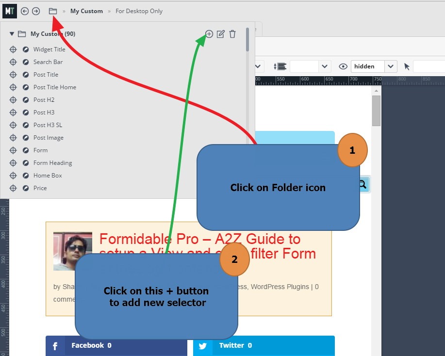
- Open Microthemer > Got to top left of the screen > Click on Manage Folder icon
- This will show all folders that contain CSS selectors. Create a CSS rule in any of the existing folder or create a new one (it will not affect the process)
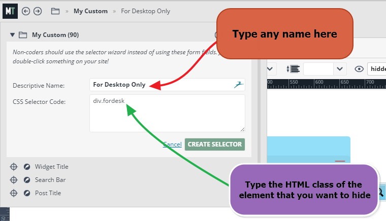
- Give any name to the selector and in Selector Code section, add the CSS class of the div element you have wrapped your content with. (see the image)
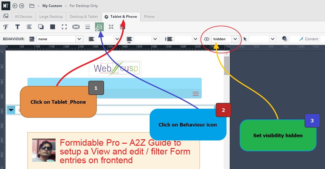
- You will notice that Microthemer offers applying of different CSS to different display sizes and these are; Desktop, Desktop and Tablet, Tablet and Phone, Phone. Thus, you can decide what style is suitable for what kind of screen size.
- As in this tutorial we want to hide some content from tablets and mobile devices, we need to click on the tab named “Tablet and Phone”
- Being on the selected tab, click on the Behavior option Icon (see the image)
- Set the Visibility to None. That is all. If everything goes right, the desired content will got hidden on the select display size.
Hope this helped you. Feel free to post a comment if you need any help.


